Skillshare Class: Colours Made Easy: Play & Explore To Find Your Style by Barbara Luel.
One of the things that fascinate me in this painting journey is the colours. Working with them can be stressful and overwhelming, but they can be a joy if used correctly. There is no shortcut to finding the colour palettes and combinations that work. Exploring them requires a lot of time and patience. This class approaches colours more emotionally rather than technically. I gave myself time to experiment and play with my palette’s colours. I just got a new watercolour set which waited to be explored, so the timing was just right for this course.
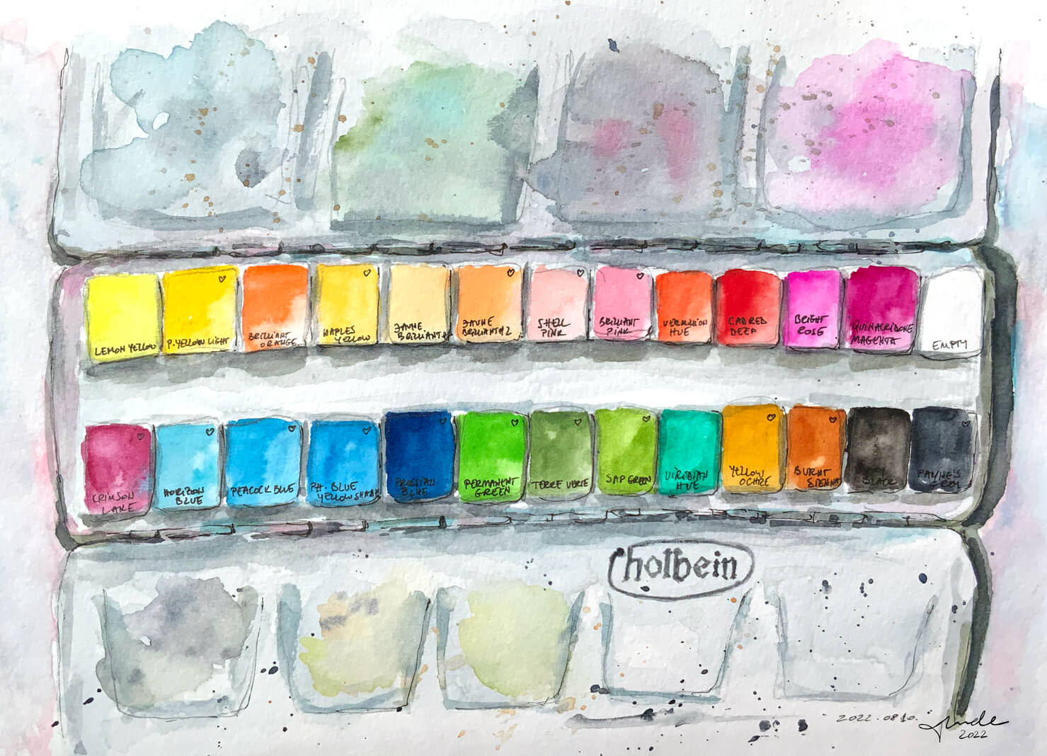
My recent colours
This is my first artist-grade watercolour set, made by Holbein, and it’s amazing to see the difference. Previously I worked only with basic colours, and I was excited about the new ones, like the set’s pink and green shades. I’m not sure which colours I’ll use more often, but I already know some of my favourites (marked with a ❤️ on the sketch). I will keep this palette as it is for now, but I need to complete it with some that I often use: Payne’s Grey, Alizarin Crimson, Burnt Umber and Raw Sienna. I’ll also get rid of the Ivory Black because I don’t use black, at all.

Summer in colours
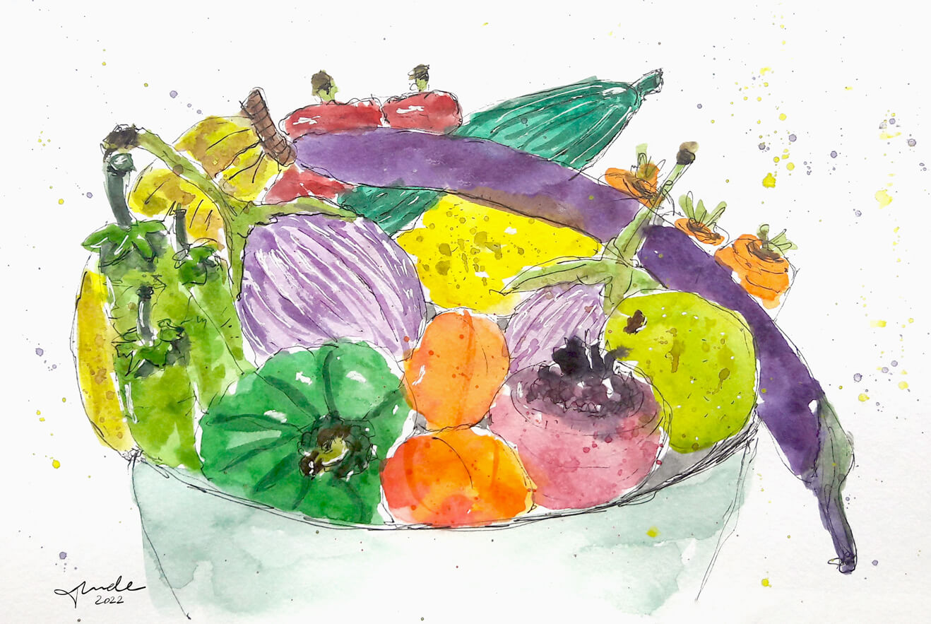
When I bought some fresh vegetables and fruits from the market, I knew I needed to sketch them. For me, this myriad of colours represents the true summer vibes. They are fresh, bright and seem so healthy. Every time I look at this sketch, it reminds me how lucky I am that I can get this yummy produce freshly from the local market.
Exploring complementaries
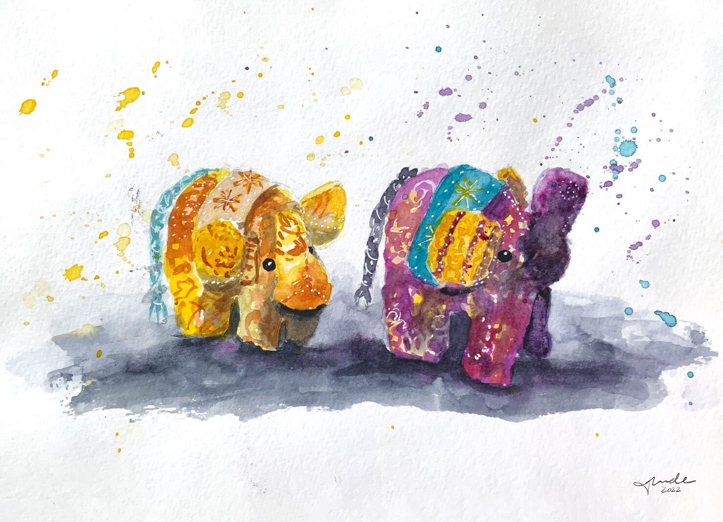
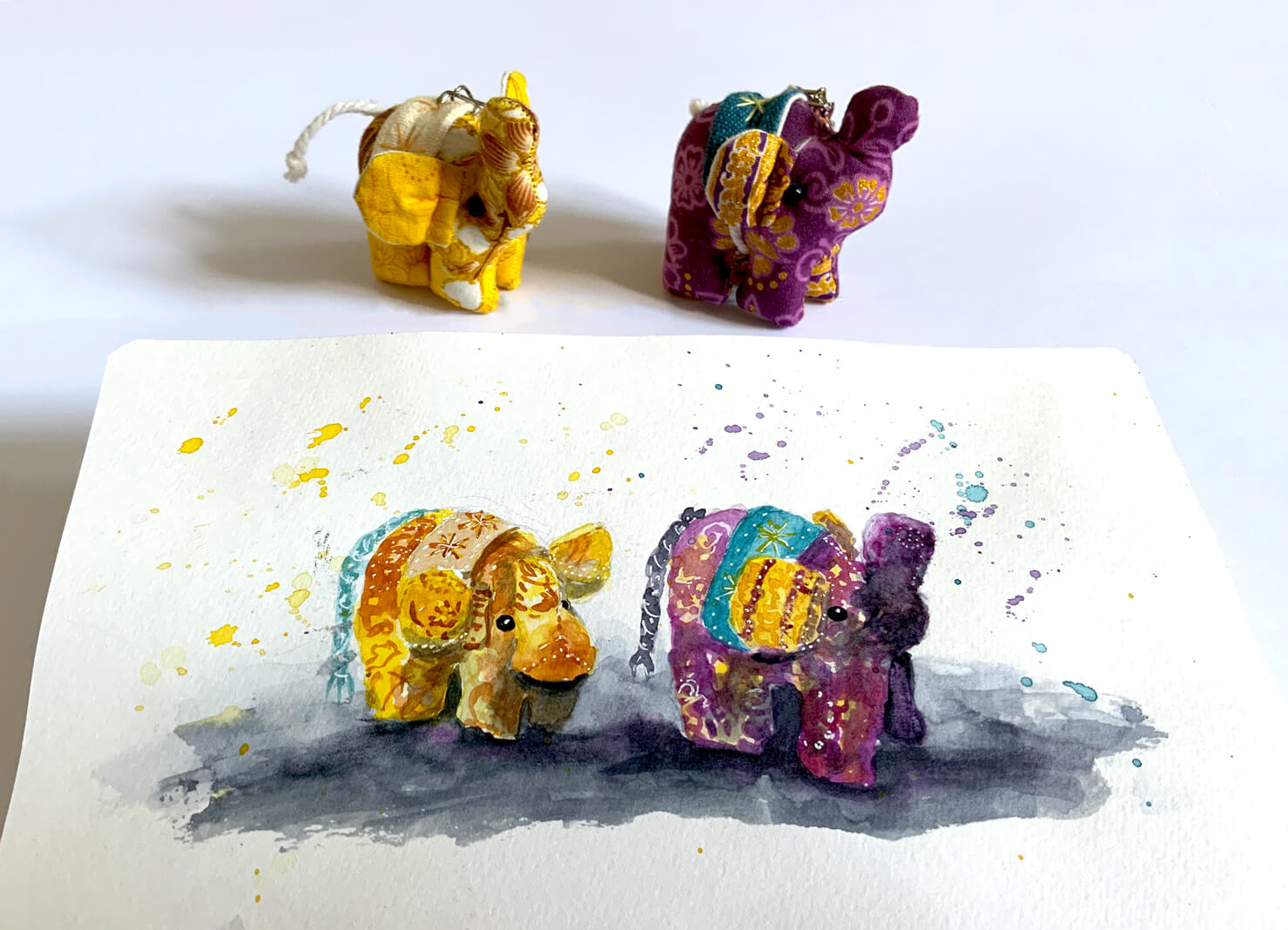
I got these elephants from a lovely person as a present from Thailand. They seemed the perfect subject to paint while exploring the complementaries, such as the yellow and violet combination. These colours accurately represent the country where these cuties were made in. Their bright colours give me joy every time I look at them. I played with the shadow-first technique here, which was new because usually, I leave the shadows as the last step. It was a bit of a challenge to get the shadows in the right place to show the handmade elephants’ stuffed nature. Initially, I didn’t think I could emphasise this characteristic, but I think that I succeeded.
Playing differently with black and white
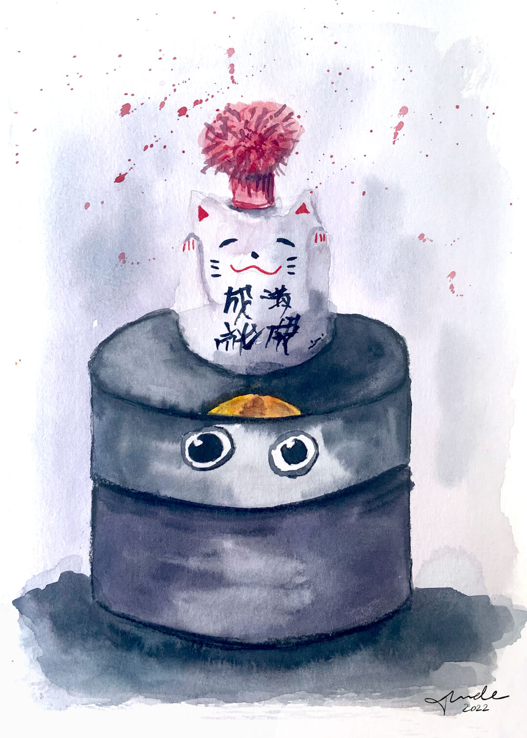
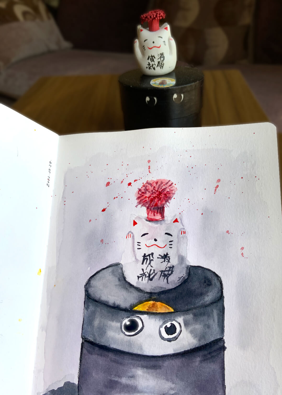
This class was an excellent opportunity to experiment with something I had planned a long time ago: depict black and white without actually using black and white paint. I chose a very simple subject for this: a handmade lucky cat with the DIY paper pompom on the top of a painted truffles box. It turns out that as long as I keep my palette minimal and consistent, I can easily reach the black and white effect. I used a lot of Payne’s Grey mixed with Violet and Alizarin Crimson to paint this funny composition.
A different approach
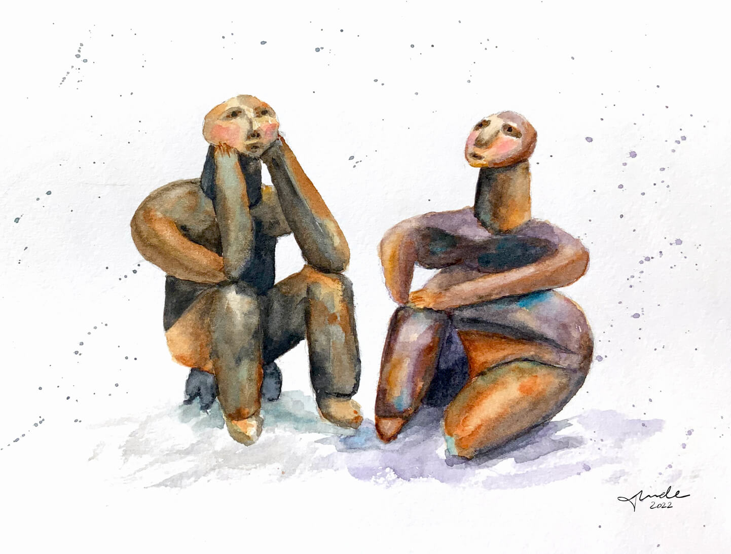
While playing with colours, some new ideas came to my mind. The teacher introduced Marc Folly‘s work as an inspiration for using colours. Seeing how he creates unique and emotional artworks with only a few colours was exciting. I wanted to paint one of my favourite statues, taking his works as an inspiration.
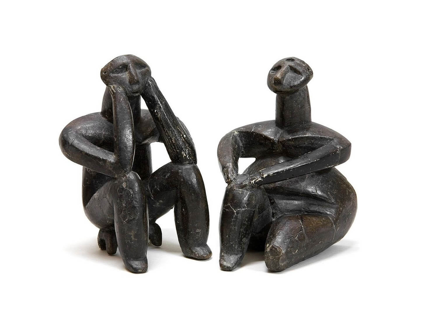
They are The Thinker and the Sitting Woman of Cernavoda, one of the oldest sculptures depicting human introspection and cognition. This neolithic masterpiece was made around 7000 years ago by an unknown artist. They were found in the southeastern part of Romania. I love everything about them: the curves, the subject and the emotions they evoke. Being a rare work of art, I was trying to be very careful with it. I used a slightly different colour palette for the male and female figure. At the same time, I tried to be bold by emphasising some spots with unexpected colour choices, like violet or turquoise. Now I have my own creation with these adorable statues.


