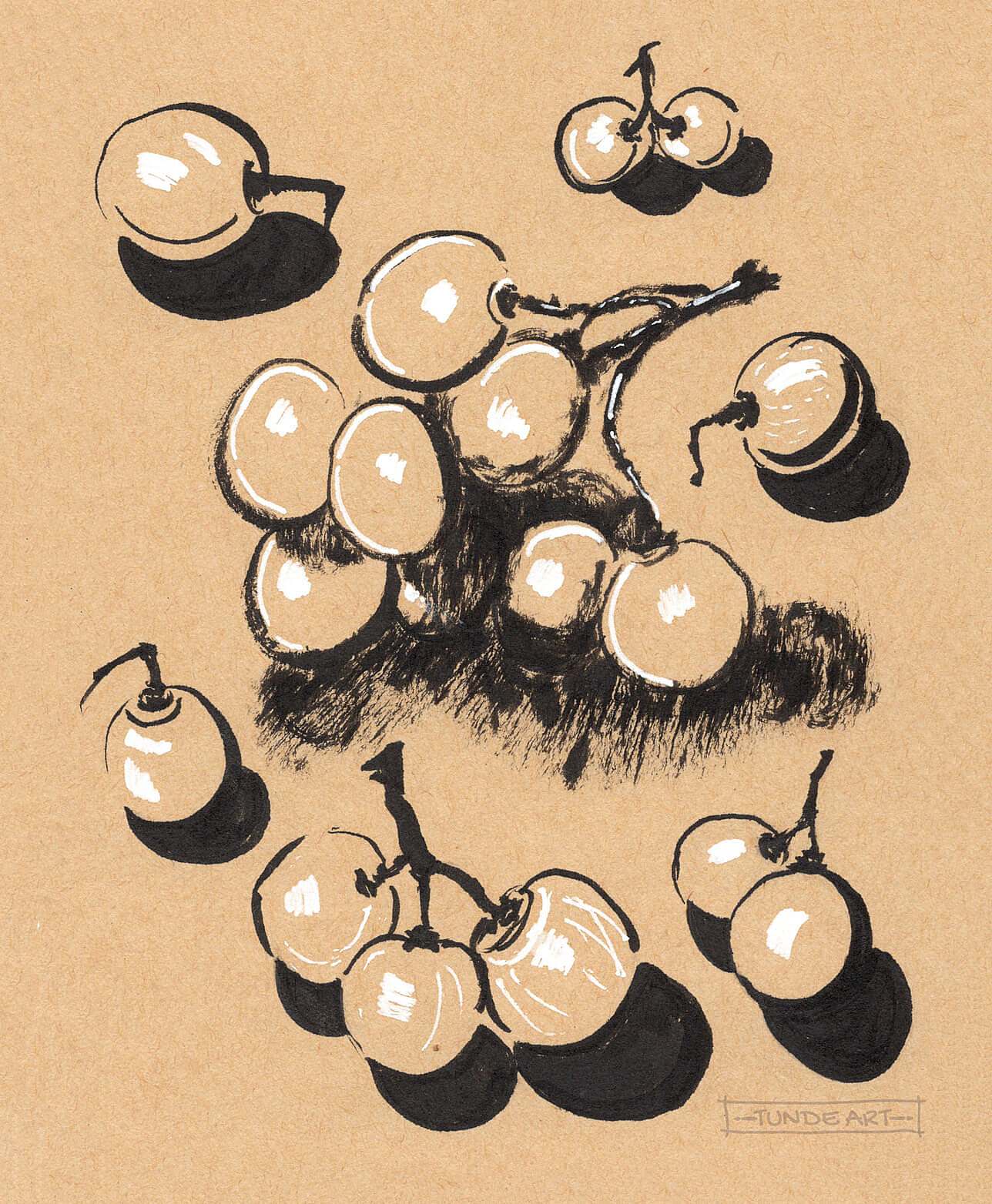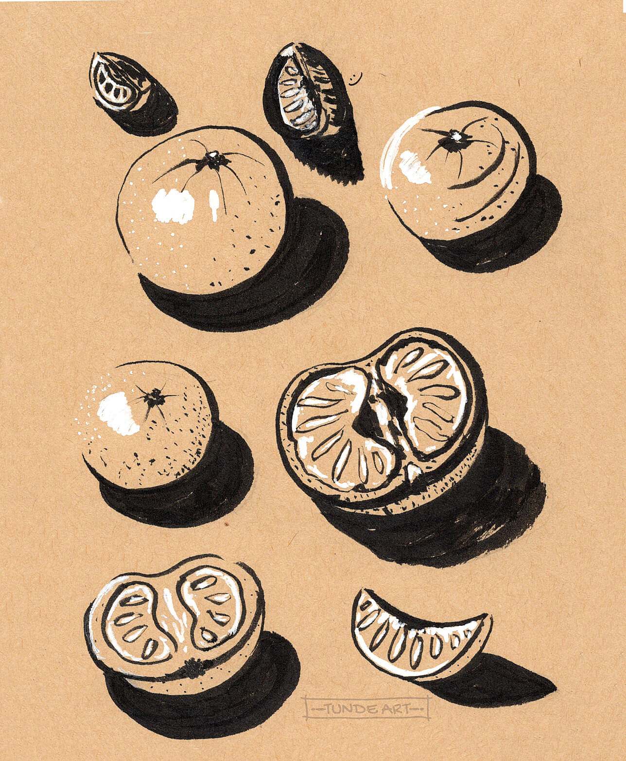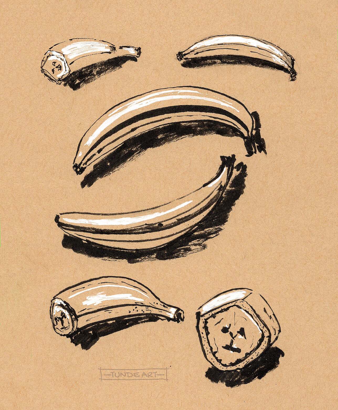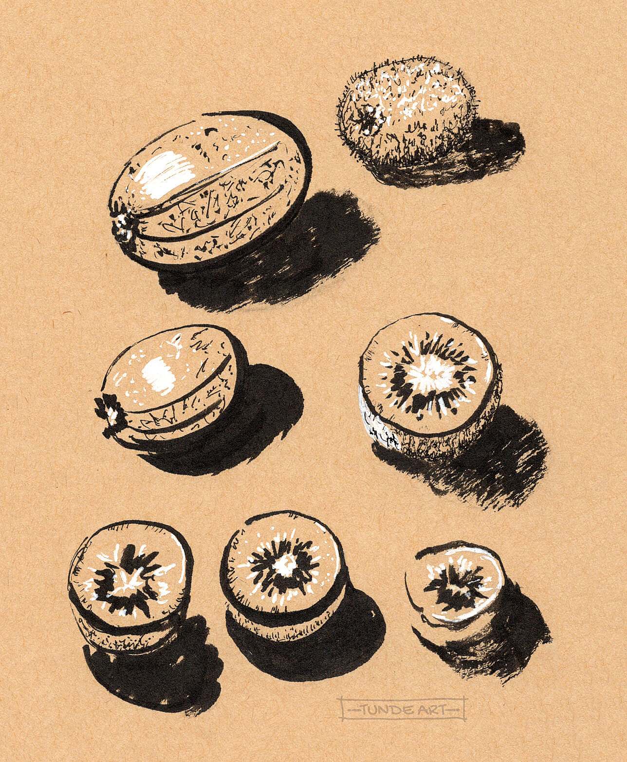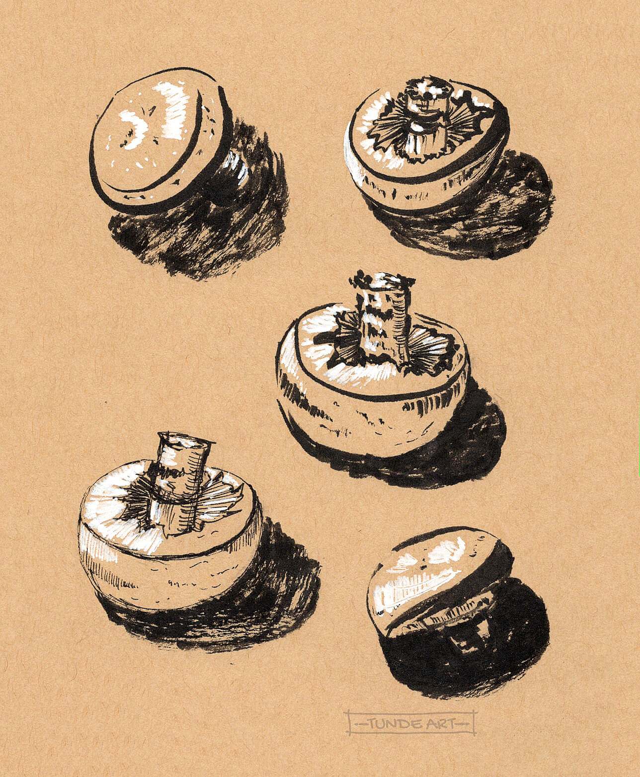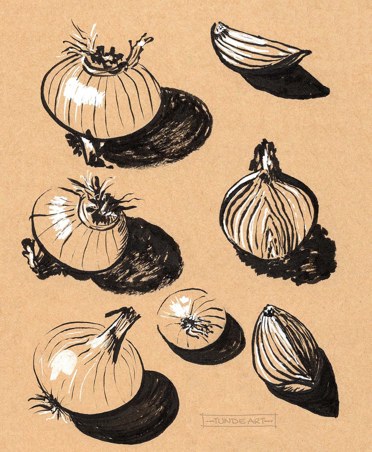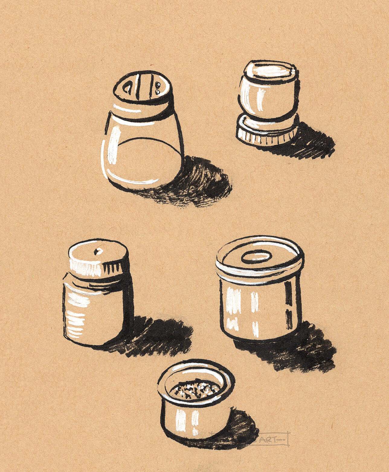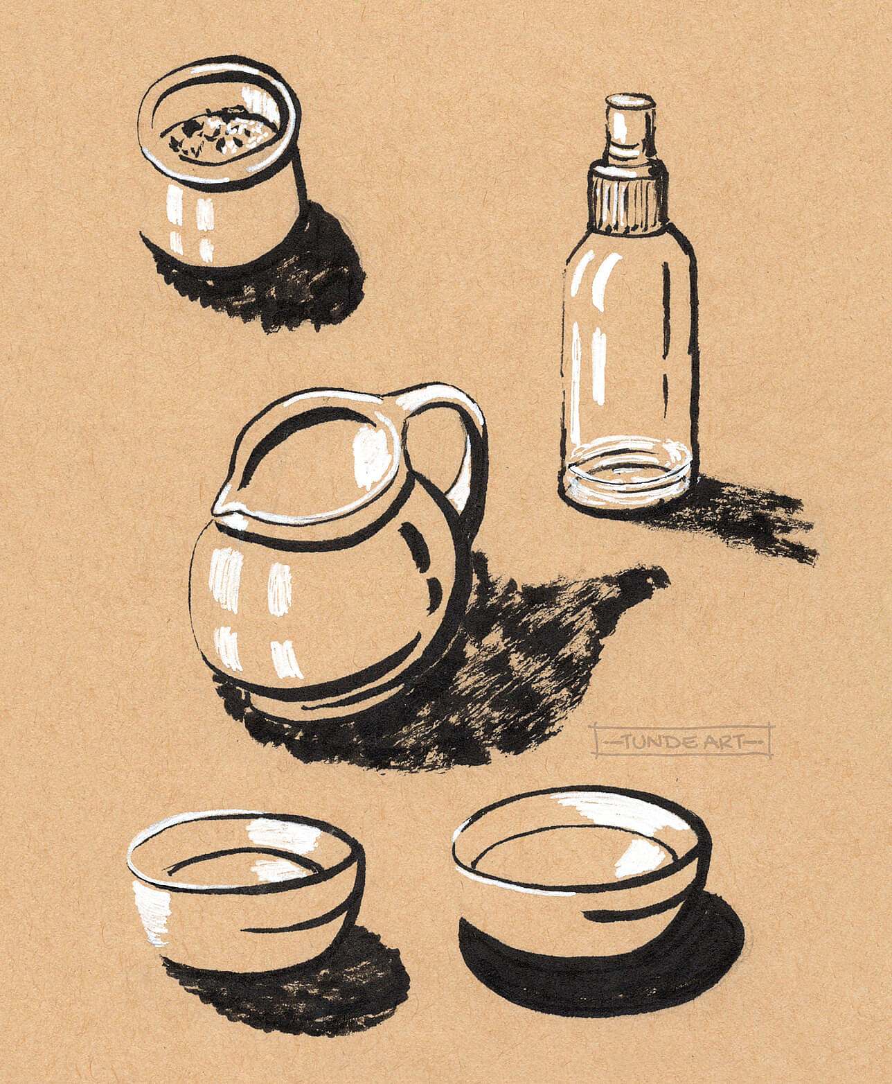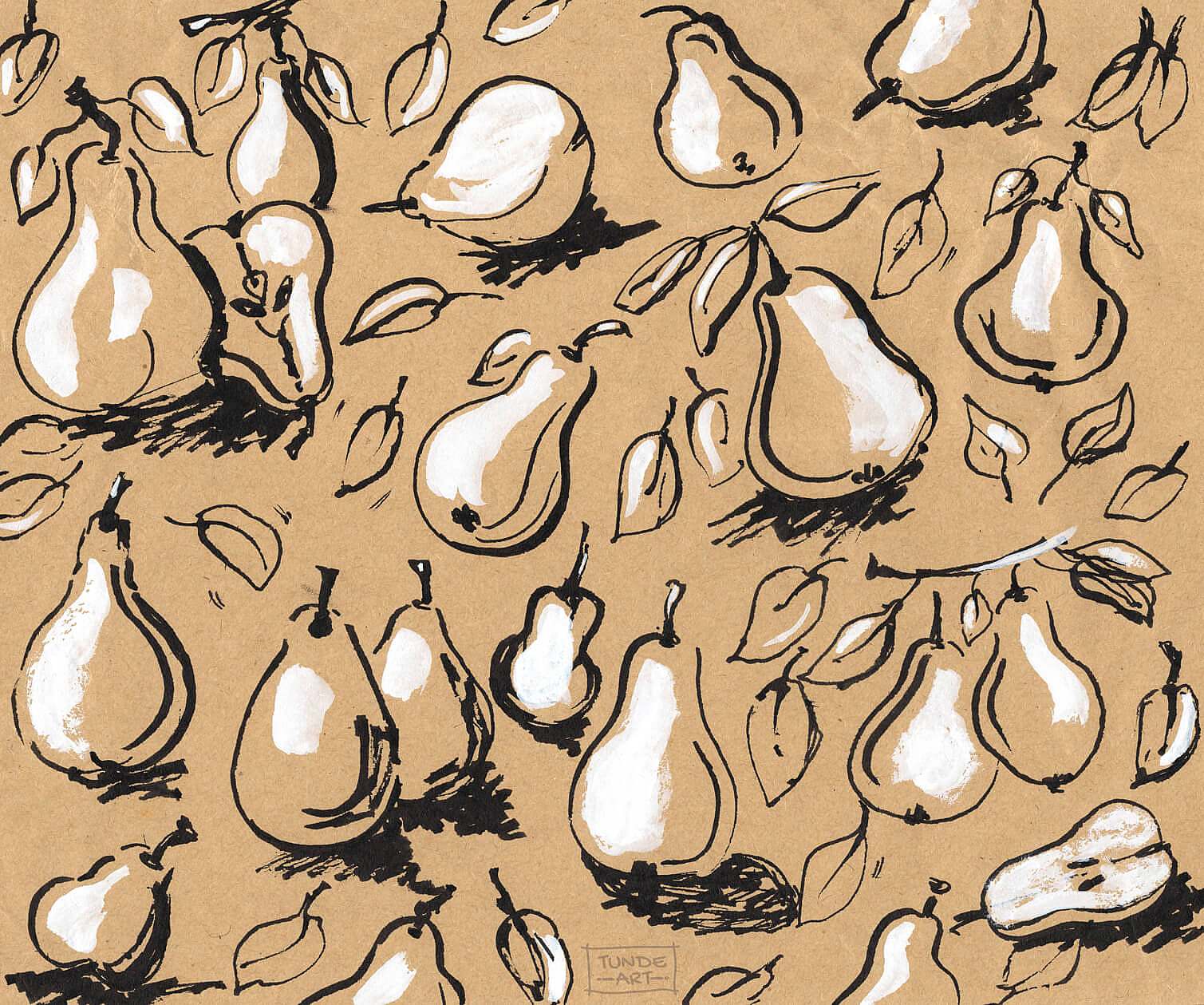
Recognising the tones and values is essential in one’s art journey. I don’t have a formal art degree, therefore, I try to learn about the basics as much as I can. I’m slowly developing my ability to see with an artist’s lens, so I was above and beyond when I saw this class coming on Skillshare. Ohn Mar Win’s course teaches how to create simple illustrations on toned paper. I saw her expressive black-and-white illustrations, and I knew that this was something I would like to dig deep in. Not just because values and tones are one of my favourite topics to explore, but because I wanted to learn everything about working with toned paper, which was new to me.
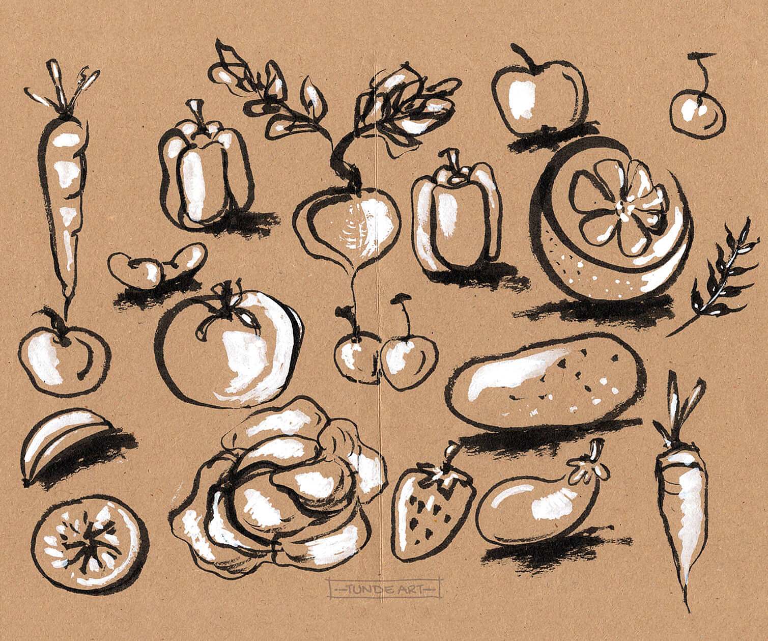
After the course was published, I immediately watched the videos, following the teacher’s drawing techniques and learning about valuable practices. While observing Ohn Mar’s drawing process, everything seemed so straightforward. I drew along with her on packaging paper just to get the idea. Copying was easy, but I soon realised that I needed time to observe the things around me and define the lightest and darkest values so that I can create my own illustrations. This is why I gave myself time to process the acquired information, while scribbling around and playing with tones, not hitting them right most of the time.
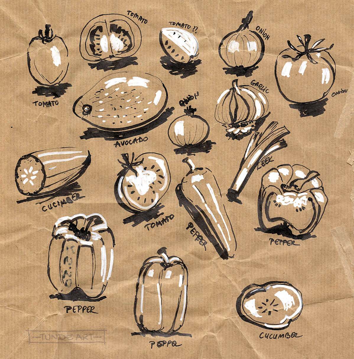
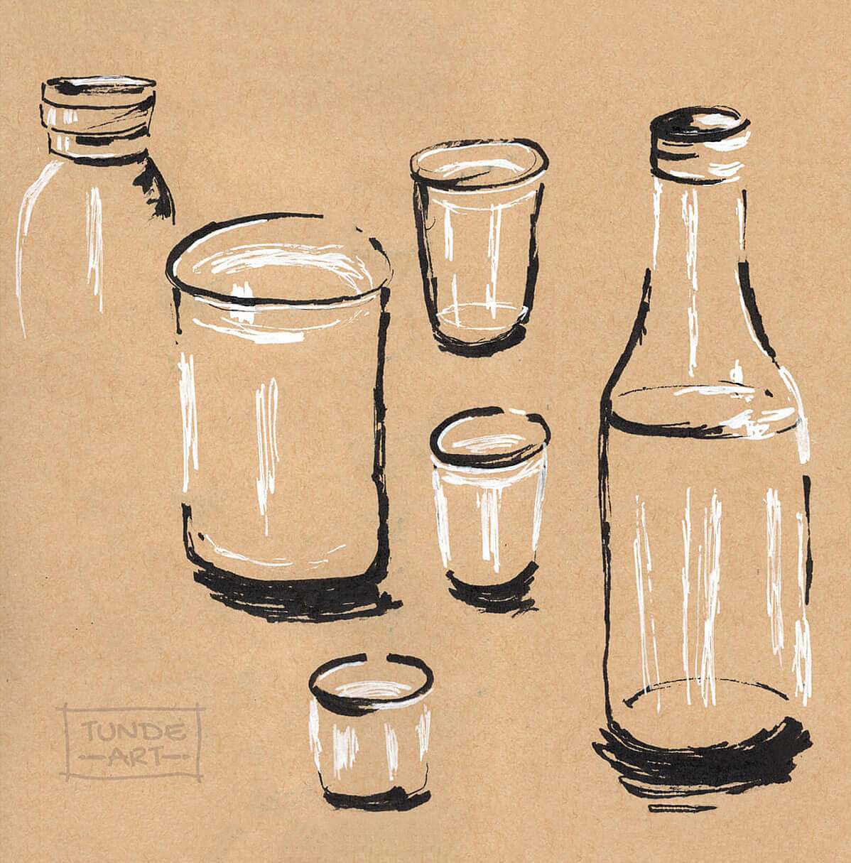
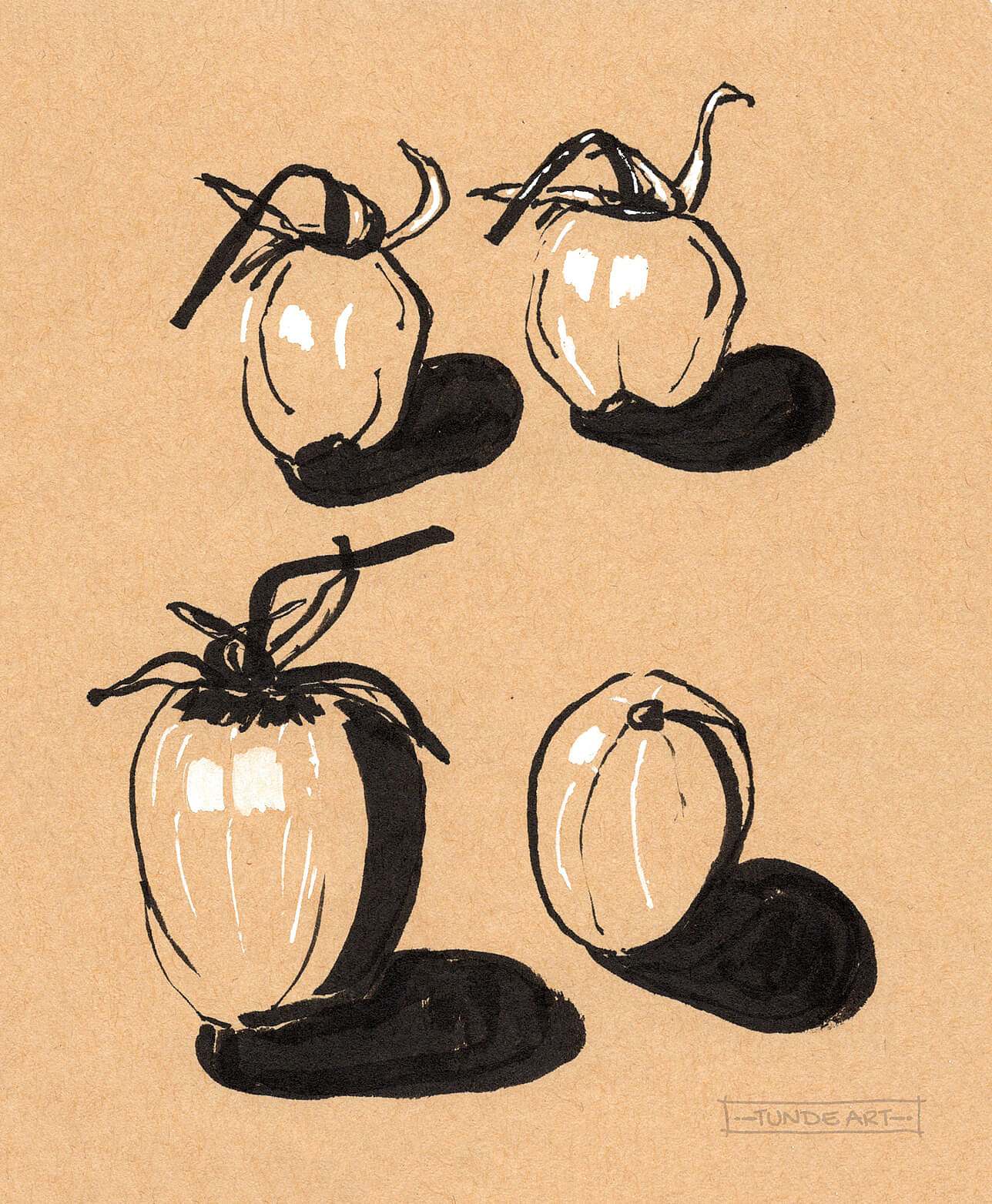
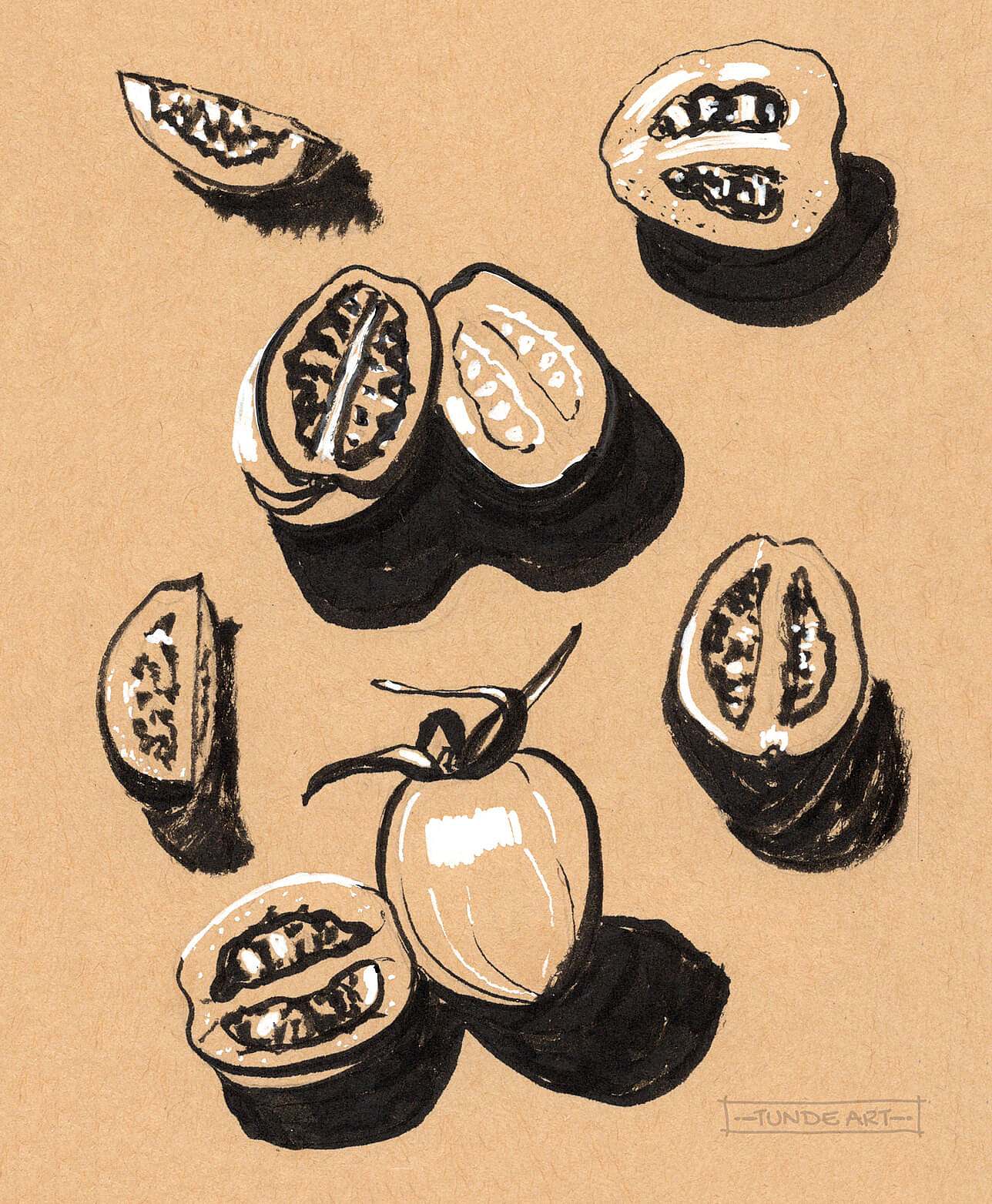
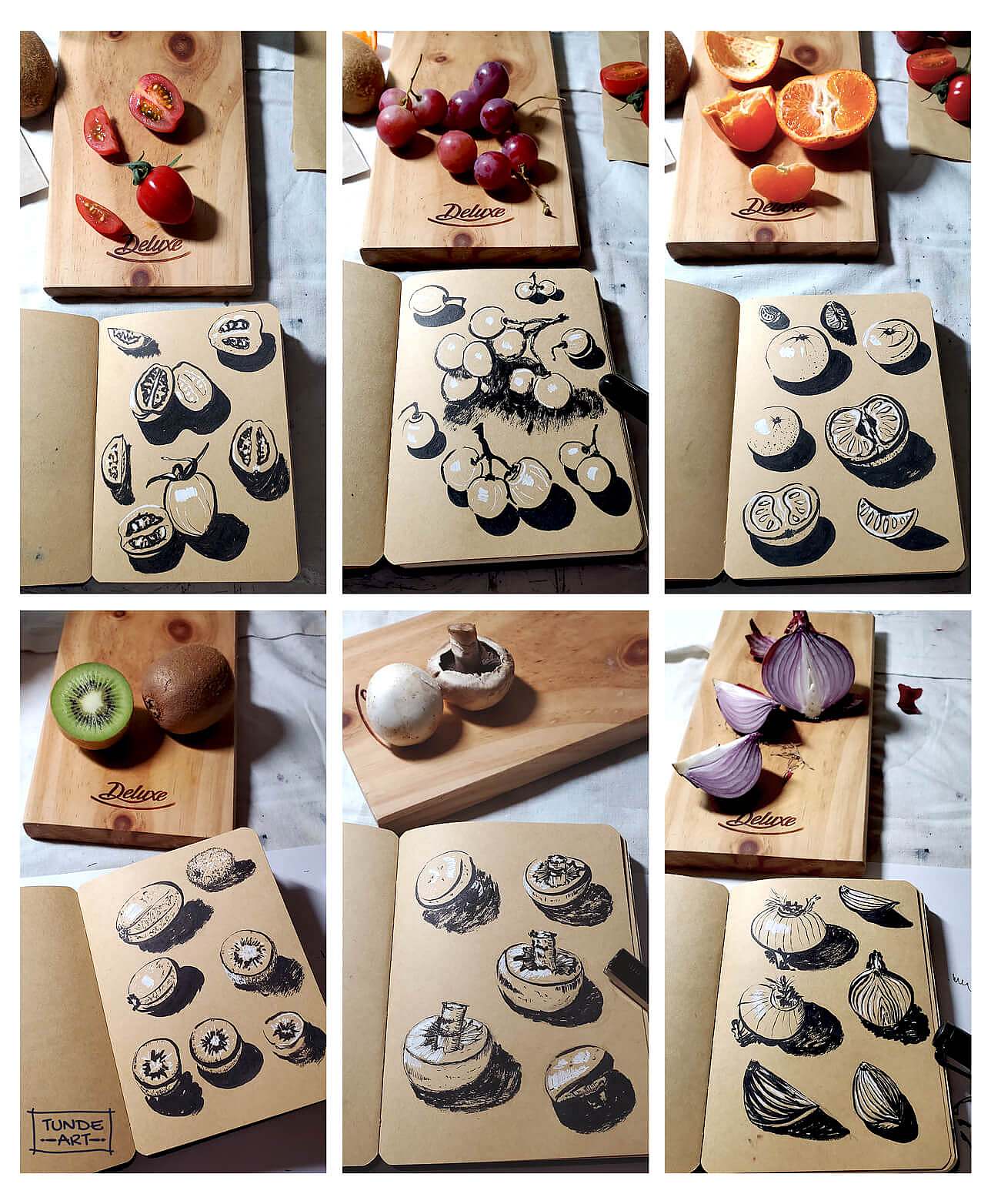
I started to really observe the surrounding things, how the light is present within the scene, and how it modulates the form of the object and the texture. Suddenly I started to see the dark and light areas on the objects, and I felt ready to create my own illustrations. I put away my watercolour set for a week and focused only on the basics: tones, values, lines, shapes, textures and paper. The class project was to observe and draw fruits, vegetables and vases.
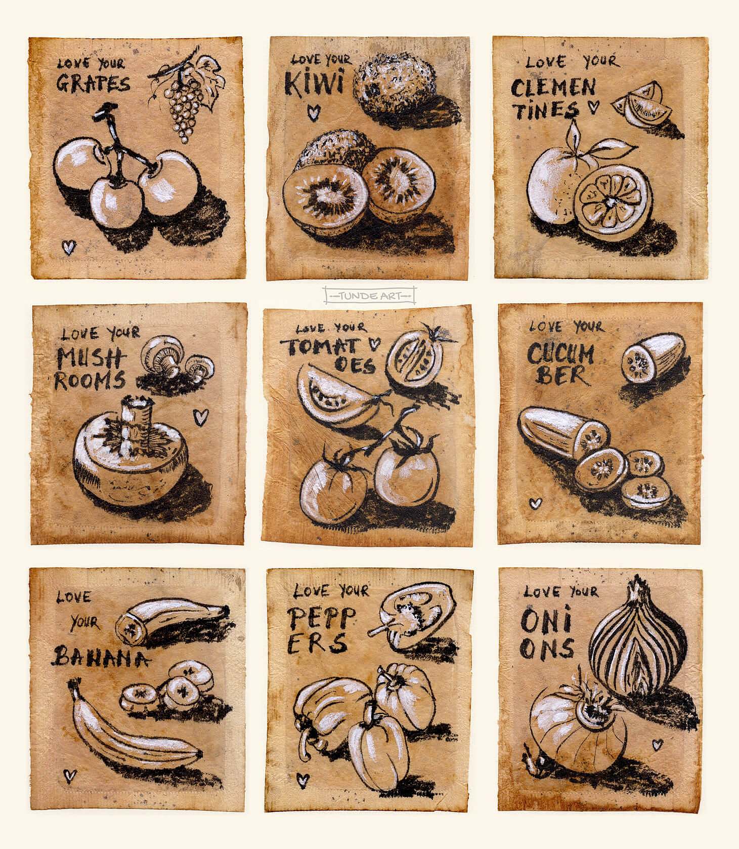
I had a sketchbook with toned paper, which I used for this project, and I also drew on recycled packaging papers that I found around the house. I think no toned packaging paper will be binned in the future. 🙂 In the creation flow, I was ideating what else could be used to draw on it in black and white. This is how I ended up with tea bags, which I recently started to collect for future artworks. The lovely tones of the black tea bags with a vintage feeling seemed perfect for this little project. I used the illustrations I experimented with, and the “Love your…” text just came ad hoc. I think it will look great on the kitchen wall.
This project was great to experiment with my pens. I used white gel pens before this, but not all work well on particular papers. They always need to be tested first. I started with using a gel pen for the white parts, but soon I realised that white gouache covers the area nicer, so I continued with that.
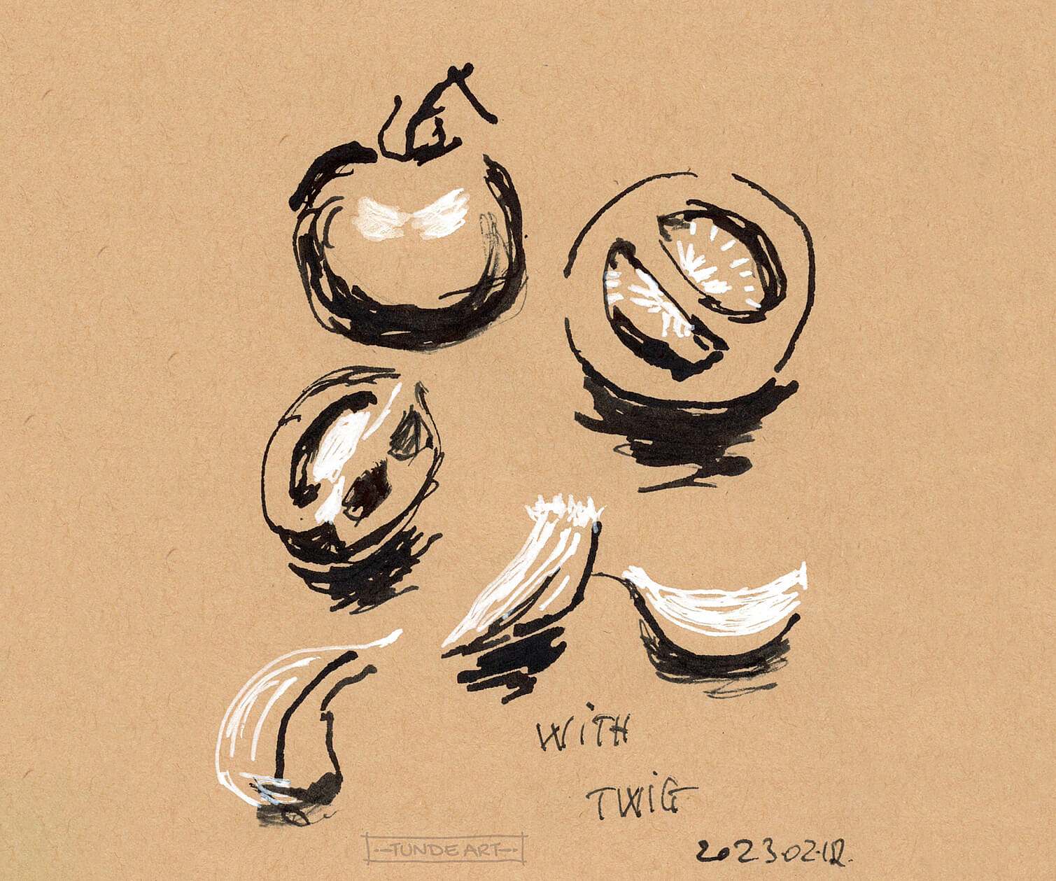
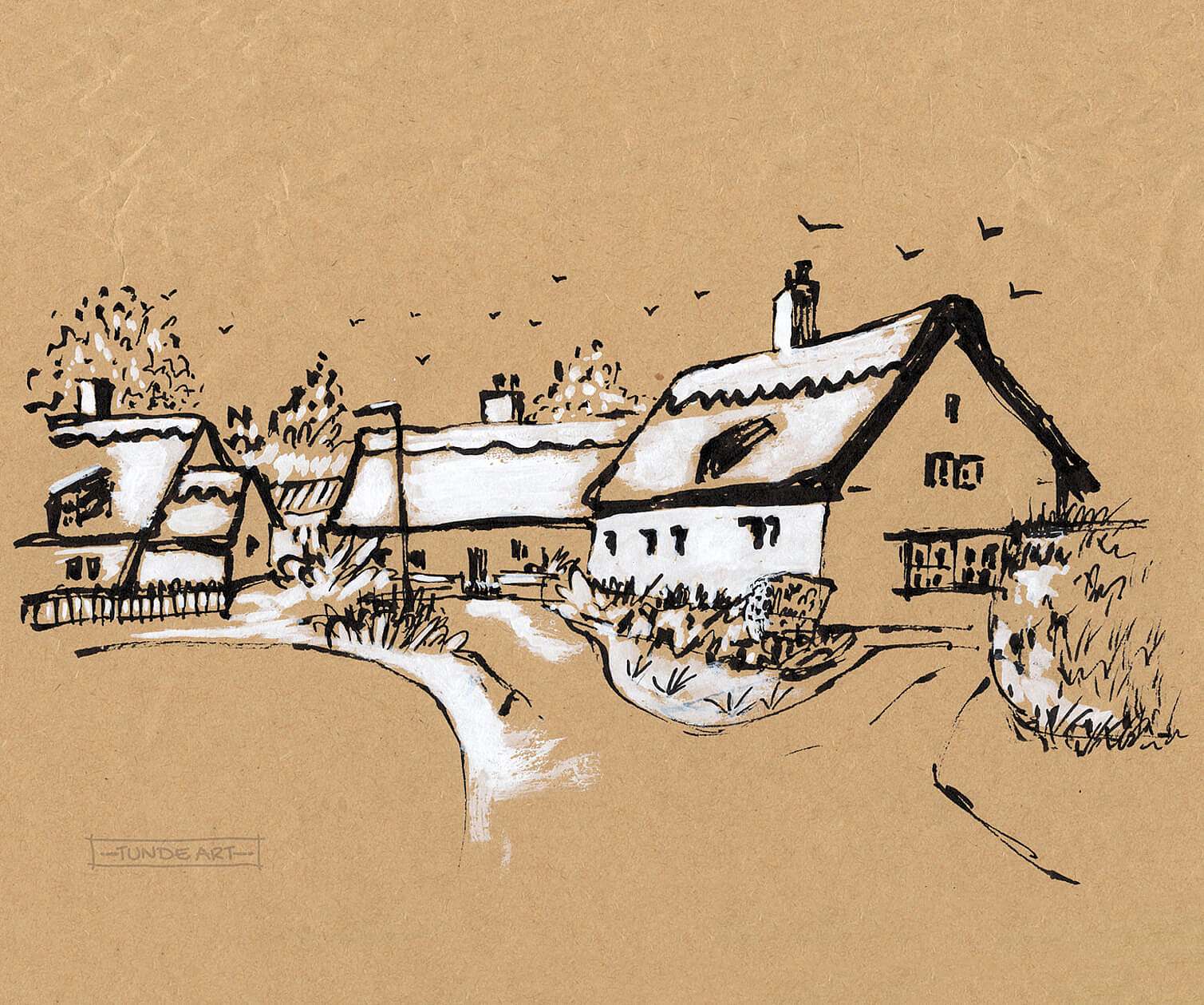
In terms of pens with black ink, I used several of them: besides using the fude pen with bent nib and the fountain pen, I got a brush pen. I needed it to draw nice curved lines (the teacher also used a brush pen). There’s a learning curve to start with it, but it became enjoyable once I got the hang of it. Here are some experiments I did with different pens and a twig with watercolour. I couldn’t resist drawing a street scene using toned paper. I kinda like how it turned out, but it definitely needs further experimentation.
I had a great time digging deep into the world of tonal sketches. This class was a great introduction to this topic, and the illustrations I created are only the beginning of a long journey. The plan is to continue my tonal studies beyond the class and train my brain to focus more on observing tones and values. I recommend this informative class to everybody who wants to add a valuable technique to their artist toolkit and have fun while observing and sketching.


